Good mobile email design is a layout that still reads when the screen is about a hand wide: one clear column where you can, columns that stack instead of squash, and nothing important trapped only in a desktop-sized row. In Milo Email Studio you build on a drag-and-drop canvas; sections stack on phones by default, a row can stay side by side, and blocks can be shown or hidden by device. Check Mobile view, send a Test to your phone, then export HTML or MJML for your ESP or push a Zoho Campaigns draft.
Most people open email on a phone. An email that looks fine on a wide monitor often turns into tiny type, side-by-side columns that squash, or a desktop nav that eats the fold. The payoff in Milo is simple. Columns stack on phones by default, a row can stay side by side when you need it, and any block can be shown or hidden by device. Build on the canvas, check Mobile view, send a Test, then hand export-ready HTML or MJML to your ESP, or push a Zoho Campaigns draft. The campaign itself goes out from your ESP.
In short
- Design for a hand-wide screen first: live text, one clear button, real alt text.
- Columns stack on phones by default; a row can stay side by side when you choose.
- Show or hide blocks by device; don't ship a second full mobile template.
- Mobile view, Test on a phone, then export HTML or MJML, or push to Zoho.
What makes an email work on mobile?
A single readable column (or columns that stack), type large enough to scan, one clear button near the top, and a Test on a real phone.
- Live text for the offer. Not only in an image, so it still reads with images off.
- Meaningful alt text. Name what the picture shows.
- One structure, not two full layouts. A second desktop layout doubles the markup; stacking plus a few show or hide blocks is usually enough.
- Sibling inbox checks. Separately check how the same email looks in dark mode and keep classic Outlook fallbacks in mind.
Why desktop-perfect emails break on phones
A two-column story row that looks balanced on a laptop can squash into thin strips on a handset. Type that felt fine at 600px becomes hard to scan. A wide nav or a row of equal buttons eats the fold before the offer appears.
The fix is not a second mobile file. It is one layout that stacks, with a few blocks you show or hide by device when you need them. How the Welcome starter's next steps stack on a phone is the same idea in practice: side by side on desktop, one column in Mobile view.
Columns that stack, or stay side by side
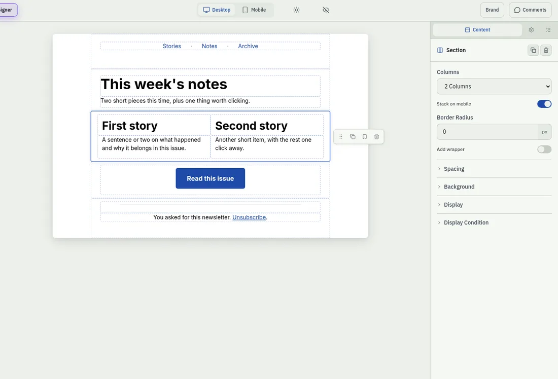
In Milo, a multi-column section has a control labelled Stack on mobile in its Content panel. Leave it on (the default) and the columns stack vertically on phones. Turn it off and that row stays side by side on mobile, shrunk to fit.
Stacking is the usual choice for stories, product cards and next steps. Keep a row side by side when the two columns belong together as one unit, such as a small icon beside a short label. MJML is what makes those columns behave; why MJML columns help on small screens is the short version.
There is no dedicated mobile starter. The Newsletter starter ("Intro plus two stories side by side") is a good place to see stacking: its two-story section is already two columns, so Mobile view shows the stack without inventing a layout. Promo and Welcome work the same way when they use more than one column.
Show or hide a block by device
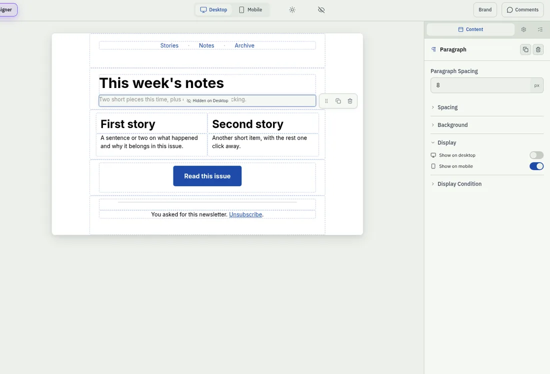
Every block can carry visibility for desktop and mobile. The editor labels are Show on desktop and Show on mobile. Turn one off to hide that block on that device. A short "Tap to shop" line can show on mobile and hide on desktop. A wide nav hint can do the opposite.
That is show or hide by device, not a second full mobile template and not a separate mobile export. A block hidden on both devices is skipped in review preview, so leave at least one of the two on.
Width, type and the thumb zone
Most email layouts still use a body around 600px wide on desktop. On phones the same layout stacks or shrinks. Keep the offer and the main button high enough that a thumb reaches them without a long scroll. Prefer live text over type baked into an image. Design in live text and Test on a handset rather than chasing a second template width.
Build it on your brand kit
Start from Newsletter when you want side-by-side stories that stack, or from Promo or Welcome. Set your colours, fonts and buttons once in a brand kit, and a new email picks them up. You can also apply a kit to an email you've already made. Free includes one brand kit.
You're the builder. The AI designer is an optional helper that drafts on-brand blocks you edit on the canvas. It can sketch a short mobile-first intro or subject and preview text from facts you give it. The final say stays with you.
Mobile view, Test on a phone, then hand it to your ESP
The canvas viewport switches between Desktop and Mobile. Open Mobile view and check that stacked columns still read, that device-only blocks appear where you expect, and that the button sits high enough.
Then send a Test to an address on your account. The subject starts with "Test:" and the email's name, so you can open it on your own phone before anyone else does. The HTML email checks we run before every export cover width, images, buttons and the rest.
When it looks right, export HTML or MJML for your ESP, or push it as a Zoho Campaigns draft. Zoho warns if $[LI:UNSUBSCRIBE]$ (or the org opt-out tag) is missing. Sending and scheduling stay in your ESP.
How we built this
On 29 October 2026 we built a short newsletter in Milo Email Studio to check the mobile controls on the canvas. We started from the Newsletter starter ("Intro plus two stories side by side") on our default brand kit.
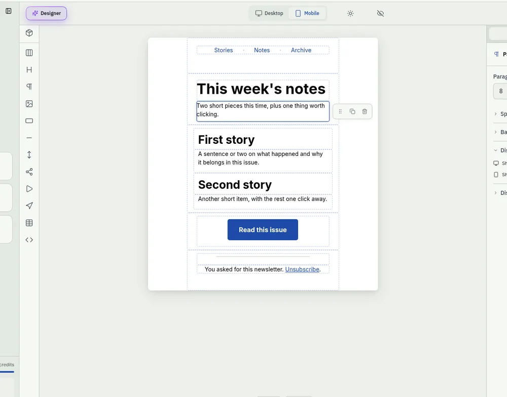
The stories section already has two columns. We left Stack on mobile on in the section's Content panel (the default), so the stories stay side by side on desktop and stack on phones.
We added a short intro line under the heading and set Show on desktop off and Show on mobile on, so the line is mobile-only. On Desktop view the canvas shows a Hidden on Desktop badge on that block.
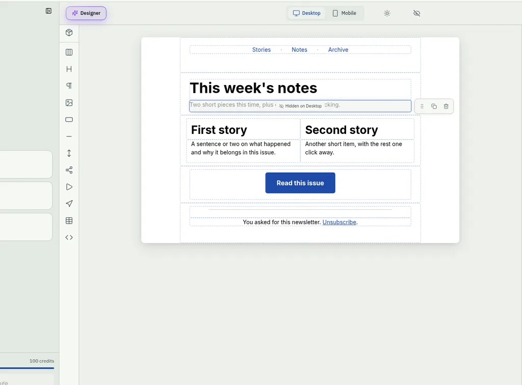
In Mobile view the intro appears and the two stories sit one above the other.
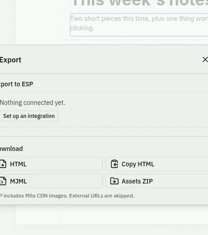
Then we downloaded HTML and MJML from Export. No ESP was connected ("Nothing connected yet"). We did not send a Test in this run. When you build yours, send a Test and open it on your phone before anyone else does.
Try it on your next email.
Questions
What makes an email work on mobile?
A readable column (or columns that stack), scannable type, one clear button near the top, and a Test on a real phone.
Do email columns stack on mobile in Milo?
Yes by default. A section can keep its columns side by side on mobile when you turn Stack on mobile off.
Can I show a block only on mobile?
Yes. Set Show on mobile on and Show on desktop off, or the other way round.
What width should an email template be?
Most email layouts still use a body around 600px wide on desktop; on phones the same layout stacks or shrinks. Design in live text and Test on a handset rather than chasing a second width.
Should I build a separate mobile email?
Usually no. One structure that stacks (plus a few show or hide blocks) keeps the file smaller and easier to maintain than two full layouts.
Is there a mobile email starter in Milo?
No dedicated one. Start from Newsletter when you want side-by-side stories that stack, or from Promo or Welcome.
How do I get it into my ESP?
Export HTML or MJML, or push a draft to Zoho Campaigns. The send stays in your ESP.