Good welcome email design is simple: thank people for signing up, look unmistakably like your brand, and give them one clear next step. Everything else can wait for the next email. Milo Email Studio gives you a Welcome starter on a drag-and-drop canvas, styled by your brand kit, so you can spend your time on the words.
Someone has just signed up. This is the email they're most likely to open, and it's the one that tells them whether joining was a good idea. A generic template makes you look like everyone else. A welcome email that looks like you from the first block, says one clear thing and points to one next step does the opposite, and it doesn't need a designer or a developer to build.
In short
- Say thanks and confirm what they signed up for, in the first lines.
- One main button, one clear next step.
- Your brand kit does the colours, fonts and buttons, so it matches every email after it.
- Include who you are and an easy unsubscribe, then test it on a phone before you export.
Why the welcome email matters more than it looks
It's the first email from you in their inbox, and it arrives while they still remember why they signed up. That makes it the moment to set expectations: who you are, what you'll send, and what to do next.
It also sets the look. If the welcome email has your colours, your type and your voice, every email after it feels familiar. If it looks like a default template, the next one has to work harder to be recognised.
What should a welcome email include?
A welcome email should include a thank-you, what they signed up for, one clear next step, who it's from and an easy way to unsubscribe. Here's what each part does for you:
- A greeting with their first name, if you have it. Your ESP's merge tag fills it in, so it feels personal without extra work.
- What they signed up for. Say what you'll send and roughly how often, so nobody is surprised by the second email.
- One main next step as a button. Start, shop or finish a profile. One thing is easy to act on.
- Two small extras at most. A help link or a popular page is plenty.
- Who it's from, a contact route and an unsubscribe link. In the UK, the ICO says you must not disguise or conceal your identity and must give a valid contact address so people can opt out or unsubscribe. GOV.UK puts it plainly too: every marketing email you send must give the person the ability to opt out.
- A preview line written on purpose. It's the line people see next to the subject, so write a preview line that earns the open.
This isn't legal advice. Check the current guidance for your market, and take advice if you're unsure.
Design that looks like you from the first block
The quickest way to look like yourself is to stop setting colours by hand. In Milo Email Studio you set your colours, fonts and buttons once in a brand kit, and a new email from the Welcome starter opens already styled with it. Your welcome email and the promo you send next month come from the same kit, so they look like they belong together.
A few design choices make the biggest difference:
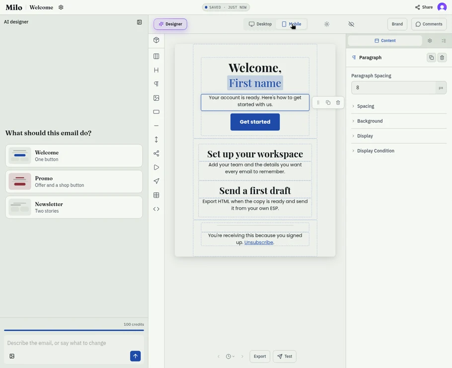
- One column. Most people will read it on a phone. A single column reads well at any width. Side-by-side blocks, like the starter's two next steps, stack into one column in Milo's Mobile view. It's still worth a Test on your own phone to be sure.
- Live text, not text in an image. Your greeting and button should still make sense with images off, and live text is what screen readers can read aloud.
- A logo that works in dark mode. A dark logo on a transparent background can vanish on a dark inbox. A solid background or light outline fixes it, and our read on dark mode email design has more.
- Room to breathe. A short greeting with space around it reads as confident. A wall of text reads as homework.
Before you export, it's worth running through the checks we run before every export: alt text, link checks, size and the rest.
One button, one next step
A welcome email with five links asks the reader to choose. A welcome email with one button tells them what to do. That's the whole case for a single call to action: it's easier to act on, and it's clear what you hoped would happen.
That doesn't mean nothing else can appear. Milo's Welcome starter is built around a greeting, one button and two next steps. The two next steps sit underneath in a quieter style, so they're there for people who want them without competing with the main button. Swap them for whatever suits you, such as "Find your scent" and "Read our care guide" for a candle shop, or delete them.
If you promised a discount at sign-up, put the code and any terms in live text, near the button. If you didn't promise one, you don't need one.
Write it in your own voice
The best welcome emails sound like a person. A short greeting, a line on what happens next and a sign-off from a real person or team is usually enough. Read it aloud. If you wouldn't say it to a customer in your shop, rewrite it.
You don't have to start from a blank page. You can build it yourself on the canvas from the Welcome starter, or describe the email you want in plain words and let the AI designer draft a first pass. The AI designer even offers a Welcome suggestion: a greeting, one button and two next steps. Either way you end up with ordinary blocks on the canvas that you edit, move or delete. The AI designer is a helper. The words, and the final say, are yours. There's more on how the AI designer drafts blocks you can edit.
When your brand kit has a merge tag set chosen, the starter's first-name greeting and unsubscribe line use your ESP's merge tags. Without one, they're placeholder text you replace before you export.
How we built this
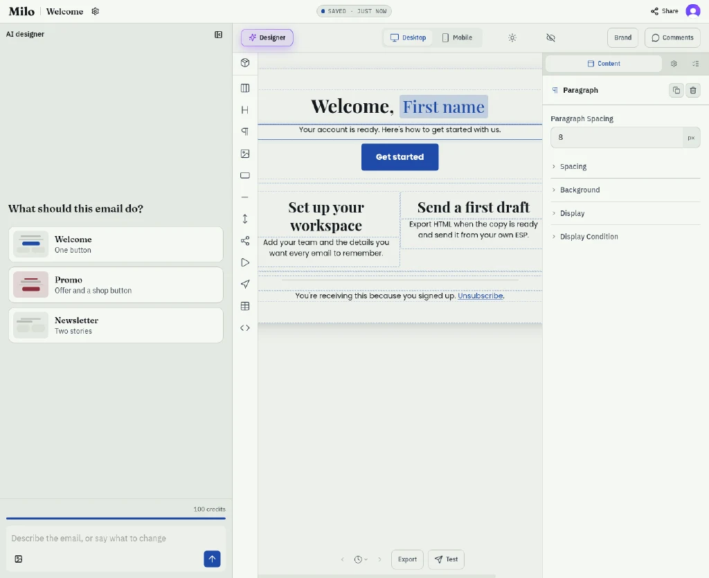
We wanted to see how quickly a good welcome email comes together, so on 22 October 2026 we built one in Milo Email Studio from the Welcome starter. It opened with our brand kit already applied: a "Welcome, First name" heading, a short intro, one "Get started" button, two next steps side by side and a footer with an unsubscribe link. The only thing we changed was the intro, to "Your account is ready. Here's how to get started with us." It saved as we went.
In the Mobile view, the two next steps stack into a single column, so they stay easy to read on a narrow screen. We didn't open this one on a real phone, so that's still worth doing with your own Test.
We built this one by hand on the canvas. The AI designer sat in the side panel with its Welcome suggestion ready, but we didn't need it this time.
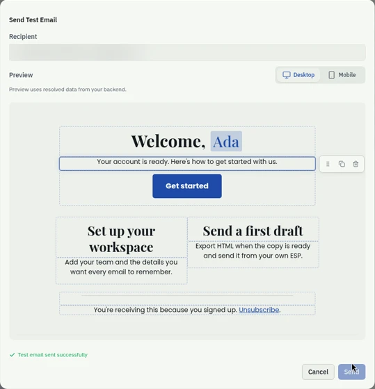
Then we sent ourselves a Test. It went to the address on our account, the preview filled in the first name with sample data, and Milo confirmed it had sent.
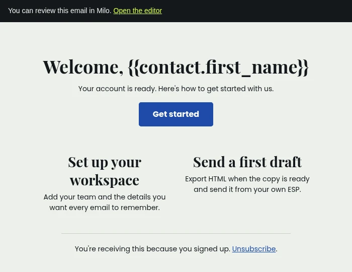
It arrived with "Test: Welcome" as the subject and a short "You can review this email in Milo" banner at the top, which links back to the editor. We hadn't picked a merge tag set in our brand kit, so the greeting still had the generic first-name tag and the unsubscribe link still pointed at the starter's placeholder. That's what a Test is for: you see exactly what to swap for your ESP's tags before you export.
From canvas to inbox
Send yourself a Test first. Milo sends the email to an address on your account with "Test:" at the start of the subject, so you can see it in a real inbox and on your phone before anyone else does. If someone else needs to approve it, get sign-off from a preview link instead of passing screenshots around.
When it's ready, export ready-to-send HTML or MJML and import the file into your ESP, or push a draft straight to Zoho Campaigns. The welcome email, or a short series, then goes out from your ESP, set to send when someone joins your list.
Try it on your next email.
Questions
What should a welcome email include?
A thank-you, what they signed up for, one clear next step, who it's from and an unsubscribe link. Keep extras to one or two small links.
How long should a welcome email be?
Short enough to read in a few seconds on a phone. One message, one button, and save the rest for the next email.
When should I send a welcome email?
Straight after someone signs up, while they still remember why. Your ESP sends it automatically when they join the list.
Should a welcome email have a discount?
Only if you promised one at sign-up. If you did, put the code and any terms in live text, not just in an image.
Can I design a welcome email outside my ESP?
Yes. Build it in a drag-and-drop builder with your brand kit, send yourself a test, then import the HTML into your ESP or push a draft to Zoho Campaigns.
Do I need a welcome series or just one email?
One good email is enough to start. Add more later when you know what new subscribers need next.