A strong one CTA email picks a single next step, puts it in live text with a descriptive button, and lets everything else stay quieter or wait for the next send. That email design hierarchy matters more now that an "open" often means an image loaded, not a person reading. In Milo Email Studio you build it on a drag-and-drop canvas from a starter and your brand kit, send a Test, then export HTML or MJML for your ESP or push a Zoho Campaigns draft.
An email that asks for four things at once reads like a waiting-room pamphlet: equal-weight buttons, vague "Learn more" labels, long centred copy, and no obvious next step. Opens no longer prove someone paid attention either, so the design has to earn a click. Put one clear action on your brand kit, keep the offer in live text, Test it, then hand the file to your ESP.
In short
- One primary ask per email; secondary links stay quieter or move to another send.
- Descriptive button text in live text, not vague "Learn more" on every block.
- Opens are a weak attention signal; design for the click and the outcome.
- Build on your brand kit, Test, then export HTML or MJML, or push to Zoho.
How many CTAs should an email have?
One primary call to action is enough for most emails; keep any secondary links visually quieter.
- Put the ask in live text, not only in an image.
- Use a button label that names the destination ("Shop the collection", "Book a demo", "Return to cart").
- Match the subject, preview text and heading to the same ask.
- Save extra offers for the next email.
That is email design hierarchy in practice: one clear path, everything else deferred.
The pamphlet problem
Some emails try to do the whole website in one send. Four or more buttons sit at equal weight. Every label says "Learn more". The body is a long centred wall of copy. There is no obvious contact route if someone has a question. Low-contrast buttons fade into the background.
None of that is a layout preference. It is a muddy ask. The reader has to choose, so many people choose nothing. A one CTA email fixes the hierarchy first: one headline, one offer in live text, one button that names the action. Quieter links can sit below if you truly need them. Competing offers wait for another send.
Opens no longer prove attention
An email "open" records that a tracking image loaded. It does not prove someone read the message. Apple Mail Privacy Protection and Gmail image caching can trigger or reroute those loads without human attention, so the open rate is a weak score for whether the design worked.
Prefer the click and what happens after it: a visit, a signup, a purchase, a reply. Milo does not replace your ESP's analytics. The design discipline still sits with you: one clear action, in live text, easy to find.
Email design hierarchy that points to one action
Lead with a calm headline that names the offer. Put the supporting line in live text underneath. Then one button with a descriptive label. Anything else (help links, social icons, a secondary page) should look quieter so it does not compete.
You already use this pattern in other emails. The welcome email's one-button pattern makes the first post-signup step obvious. A cart reminder with one way back does the same for recovery. AI inbox summaries need a clear action too, so the summary has something real to surface. And preview text that supports the same ask keeps the inbox line matched to the button.
Vague labels are the tell. "Learn more" and "Click here" do not say where the click goes. "Shop the autumn collection", "Book a 15-minute demo" or "Return to cart" do.
One brand kit, one template version
Hierarchy fails when every teammate ships a different look. One person picks a blue button. Another picks green. A third pastes a JPEG hero with the offer baked in. The inbox no longer looks like one shop.
One brand kit so every email looks like the same shop sets colours, fonts and buttons once. A new email picks them up. You can apply a kit to an email you have already made. Free includes one brand kit. Keep one template version for the one-ask promo, then change the words and the link for each send. The hierarchy stays; the offer changes.
Build it with the AI designer as a helper
There is no "one CTA" or hierarchy starter in Milo. Start from Promo ("Offer headline, supporting copy, and a shop button") or Welcome ("Greeting, one CTA, and two next steps"). Promo already centres one shop button. Welcome gives you one main button with two quieter next steps underneath; keep or delete those extras so only one ask carries the weight.
You're the builder. The AI designer is optional when you want a first pass on the words. Tell it the single next step, the offer, and the button label. It drafts on-brand blocks you edit on the canvas. It can set the name, subject and preview text too. Never leave competing buttons it added; delete or quiet them. There's more on how the AI designer drafts blocks you can edit.
When you want a labelled "before" example of the pamphlet problem, Duplicate the good email, then deliberately add three equal-weight buttons with vague labels on the copy. Duplicate keeps the blocks, brand kit, subject and merge-tag dialect. It does not copy the due date. Mark that version as a bad example in any screenshot so nobody ships it.
Test, then hand it to your ESP
Send yourself a Test before the email goes anywhere. Milo sends it to an address on your account with a subject that starts "Test:" plus the email's name, so you see it as a recipient would. Check the offer still reads with images off, the button label names the action, the link is real, and the footer has an unsubscribe route. The checks we run before every export cover the rest.
Then take export-ready HTML or MJML into your ESP, or push it as a Zoho Campaigns draft. If you push to Zoho, keep its unsubscribe tag, $[LI:UNSUBSCRIBE]$, in the footer. Milo warns you before the push if it is missing. Scheduling and sending stay in your ESP.
How we built this
On 29 October 2026 we built one promo with a single ask in Milo Email Studio, by hand on the canvas. We opened Brand, applied our default kit (blue button, #1F4BA8) and got the "Brand applied to canvas" toast.
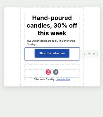
The email started from the Promo starter and we named it "One action promo". We deleted the starter eyebrow "This week only". The headline is "Hand-poured candles, 30% off this week" in live text. The supporting line is "Our winter scents are back. The offer ends Sunday." The button Text is "Shop the collection" and the URL points at a placeholder offer link. The footer stayed. We built it by hand rather than with the AI designer.
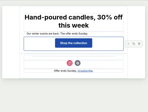
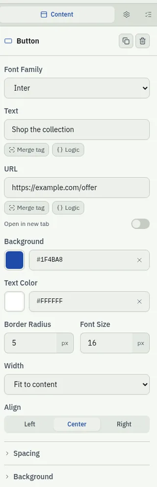
With the button selected, the Button panel showed Font Family, Text, URL, Open in new tab, Background (#1F4BA8), Text Color, Border Radius, Font Size, Width and Align.
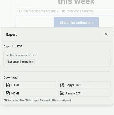
We opened Export: under Export to ESP it said "Nothing connected yet", and under Download we took HTML and MJML (Copy HTML and Assets ZIP were there too). Both exports keep one Shop the collection button.
Try it on your next promo.
Questions
How many CTAs should an email have?
One primary call to action is enough for most emails; keep secondary links quieter or save them for the next send.
What is email design hierarchy?
It is the order of attention on the page: heading, offer in live text, one clear button, then quieter extras.
Why avoid "Learn more" on every button?
It does not say where the click goes. Name the action in the button label.
Do open rates still matter?
Treat them as a weak signal. An open often means an image loaded, not that someone read the email; design for the click and the outcome.
Can the AI designer keep the email to one ask?
Yes, if you tell it the single next step and then edit anything that adds competing buttons.
How do I keep every email looking consistent?
Use one brand kit so colours, fonts and buttons stay the same while each email keeps its own one ask.
How do I get it into my ESP?
Export HTML or MJML, or push a draft to Zoho Campaigns. The send stays in your ESP.